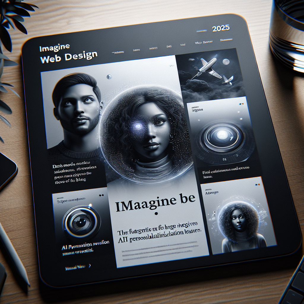
In 2025, web design is set to evolve in ways that challenge and inspire creators to rethink their approach. This article delves into the pivotal web design trends that will shape user experiences, drive engagement, and enhance functionality. As we explore these key trends, you’ll gain valuable insights to ensure your website remains relevant and captivating.
Embracing Dark Mode and Color Accessibility
Dark mode continues to gain traction as a popular choice for user interfaces, making it essential for web design in 2025. This trend not only enhances visual comfort but also conserves battery life on OLED screens. As you consider your website’s design, implementing a dark mode option can significantly improve user experience, particularly for those browsing in low-light environments.
However, it’s crucial to go beyond simple color changes. Color accessibility is becoming increasingly important as more users demand inclusivity in design. Utilizing tools to test color contrast ensures that your site is usable for individuals with visual impairments. Providing high-contrast options and alternative text for images can greatly enhance the accessibility of your content.
AI-Driven Personalization
Artificial Intelligence (AI) is revolutionizing web design by enabling hyper-personalized experiences. In 2025, more websites will use AI algorithms to analyze user behavior and preferences in real-time, creating customized content that resonates with individual users. This level of personalization may include tailored recommendations, dynamic layout adjustments, and even personalized communication strategies.
To effectively leverage AI-driven personalization, it’s essential to ensure that your website architecture supports these technologies. Employing user data analytics tools and chatbots can facilitate engagement and provide insights to improve the user journey. In doing so, you’ll foster stronger connections with visitors, which can boost conversion rates and customer loyalty.
Responsive Design with Fluid Layouts
The growing prevalence of various devices accessing the web underscores the necessity for responsive design. By 2025, websites must support a multitude of screen sizes and orientations, and fluid layouts will be critical in achieving this goal. Rather than relying solely on fixed-width elements, designers should focus on flexible grids and media queries that adapt seamlessly across platforms.
Utilizing a mobile-first approach when designing your site will enhance usability on smartphones and tablets, which continue to dominate web traffic. Prioritizing that design can create a better experience for your users no matter how or where they connect. This shift will not only enhance user satisfaction but also positively influence your site’s search ranking and visibility.
As we navigate the dynamic world of web design, embracing these trends will empower your online presence. By staying attuned to user preferences and technological advancements, you will create a website that captivates and engages visitors, ultimately driving your success in the digital landscape.